If you're like me, you take joy in making everything by hand, not just jewelry. Most of my craft show displays have been either made from scratch or customized. I do this both because it is often less expensive to build than it is to buy, and because it gives displays a unique look so they don't blend in at shows.
Here's a list of some of my favorite ways to build or customize craft show displays. Feel free to adapt them to suit your tastes, after all, your business should reflect you!
1. Painted Thrift Store Finds
I have found wooden bowls, wicker baskets, odd candle pedestals and wooden divided lunch trays at thrift stores. Usually, they don't look like much when I find them and have a good deal of wear or staining. I like to sand them lightly with a medium grit paper (around 400) and then paint them with a couple of coats of interior latex paint. It gives them a fresh face and if you paint them all in the same color, it can give you a cohesive display even if the pieces are different in shape.
The reason I use interior latex is because it dries harder than artists acrylic. If you paint objects with acrylic, it will be more likely that the paint will stick to plastic, glass, paper or other painted surfaces, and lift onto the objects being displayed. The safest way to protect against any paint lifting is to line the container or tray with fabric or a filler before adding your display items.
2. Paper Mache Bust / Necklace display
I started with a framework of mesh and wire, but you could just as easily use a balloon for the head and crumpled up newspaper taped together for the neck and shoulders. You don't need to put features onto the bust, just shape it into the general impression of a life sized head, neck and shoulders. Another option is to use plaster of paris to actually cast a bust of yourself or a friend, then once it is cured add a base with more plaster so that it will stand up.
Either method of building a bust can then be painted, decoupaged, or left as is, depending on the look you're going for.
3. Suitcase
I've said before that I love suitcase displays, especially if they are made so that they can just be opened and popped up on a table, for a super fast setup. One method to accomplish this is to remove the "guts" of the suitcase or briefcase, up to and including the liner if you're comfortable with it. You can then re-line the case with fabric or vinyl, or you could even paint the inside of it if the original liner came out cleanly. You could add cork board sheeting, chalk board paint, or a magnetic surface to the inside of the lid, where you can hang items for display, write messages, or display magnetic items. You can use self-adhesive hooks or magnetic hooks as well.
The bottom of the case can be filled with bins to hold items or it can serve as a large basket for loose items.
4. Frames
I have used frames a few different ways in my displays: I covered a frame with fine mesh to display earrings & necklaces, I've filled a frame with a sheet of cork-board to display thumbtacks or use tacks as hooks to display jewelry. There is also the link I posted previously for filling small frames with ring-holders. I like frames because they can be used either flat on a table or vertically, especially if the original back of the frame is still in-tact and can hold it upright or allow it to hang from a fixture. The frame itself can add some visual blank space between sections of your display, giving the eye a place to rest before moving on to the next display. They can also be painted to match the rest of your display and you can even paint over a cork board in a frame.
5. Tiered Displays
You could buy tiered dessert/serving trays at some major stores and vintage stores, but it's fun to make a unique version yourself. If you can find a few glasses (stemmed are great) or even medium-tall candle holders, as well as some assorted sizes of plates, they can be glued together in a stack to form a unique tiered display. I recommend using a glue like E9000 or Gorilla, something that adheres well to glass & smooth surfaces. White glue or hot glue does not normally form a good adhesion to non-porous surfaces.
There are many other ways to build & create your own displays, these just happen to be my favorites. More ideas can be found on the JellyPins Pinterest board, and I add to it often when I find fun ideas!
Amber

Showing posts with label setup. Show all posts
Showing posts with label setup. Show all posts
Monday, September 9, 2013

Tuesday, September 3, 2013
How to Make Craft Shows a Little Easier
Anyone who has sold handmade goods at a craft show knows it is exhausting. Not only are we operating a pop-up store for hours on end, but we have to make that store appear and disappear, often all in a single day. It makes me tired just thinking about it!
Over the years, I've learned a few tactics to help make the craft show experience a little easier:

Ready To Go Displays -
Any aspect of your display that can be arranged or set up before hand will save you time and effort on the day of the show. Jewelry trays with the items laid out in advance, hanging racks with the jewelry hung on it and folding cases that stand vertically on the table are just a few examples of methods to have jewelry laid out and ready to go in a snap.

Business Operations in a Briefcase -
You can use a briefcase, small suitcase, lock box or even a plastic container to keep all of your transaction tools in one place and ready to go from show to show. I use a briefcase that holds my packaging & bags, change, pens, business cards, Square reader, calculator and ledger. When I arrive at a show and set up, I just put the case on the table, open it up and I'm ready to go. Because most of the items stay in there between shows, I always know where everything is and there is no last minute searching the night before or day of the show.

Folding Dolly / Carts -
These are really efficient because they fold up to be kept in your vehicle or under a table at a show, but they can hold a great deal with the addition of bungee cables. I've used these for years, and it has reduced the number of load-in trips to just one, and saved my back!
Pricing Reminder Card -
This is most effective if you have groups of items that are all the same price. I like to price these with signs, but it has lead to moments where I forget exactly what was on the sign so in mid-transaction, I have to run around the table and look at the sign. In order to make it easier, I take an index card and write down the price of any of these types of items and keep it in my briefcase. That way, I only need to glance at the card for a moment to make sure I'm charging the right prices.
Setting up Square -
The Square app has the ability to store your item information. During a transaction, whether cash or credit, you can tap the item you are selling rather than having to put items in individually or tally them up & write them in a ledger separately. Click here for Square's instructions on setting this up for the smart phone app.
With these tips you can set your display up ahead of time, have everything in one place & get it into your booth a little easier, so that you can spend all your energy on having a great show!
Amber
Over the years, I've learned a few tactics to help make the craft show experience a little easier:

Ready To Go Displays -
Any aspect of your display that can be arranged or set up before hand will save you time and effort on the day of the show. Jewelry trays with the items laid out in advance, hanging racks with the jewelry hung on it and folding cases that stand vertically on the table are just a few examples of methods to have jewelry laid out and ready to go in a snap.

Business Operations in a Briefcase -
You can use a briefcase, small suitcase, lock box or even a plastic container to keep all of your transaction tools in one place and ready to go from show to show. I use a briefcase that holds my packaging & bags, change, pens, business cards, Square reader, calculator and ledger. When I arrive at a show and set up, I just put the case on the table, open it up and I'm ready to go. Because most of the items stay in there between shows, I always know where everything is and there is no last minute searching the night before or day of the show.

Folding Dolly / Carts -
These are really efficient because they fold up to be kept in your vehicle or under a table at a show, but they can hold a great deal with the addition of bungee cables. I've used these for years, and it has reduced the number of load-in trips to just one, and saved my back!
Pricing Reminder Card -
This is most effective if you have groups of items that are all the same price. I like to price these with signs, but it has lead to moments where I forget exactly what was on the sign so in mid-transaction, I have to run around the table and look at the sign. In order to make it easier, I take an index card and write down the price of any of these types of items and keep it in my briefcase. That way, I only need to glance at the card for a moment to make sure I'm charging the right prices.
Setting up Square -
The Square app has the ability to store your item information. During a transaction, whether cash or credit, you can tap the item you are selling rather than having to put items in individually or tally them up & write them in a ledger separately. Click here for Square's instructions on setting this up for the smart phone app.
With these tips you can set your display up ahead of time, have everything in one place & get it into your booth a little easier, so that you can spend all your energy on having a great show!
Amber
Thursday, August 29, 2013
The Weekly Ten - Fab Craft Show Booths
For this week's post of ten things I adore, I want to share with you some lovely craft show displays found on Pinterest and Flickr. Thanks to the people who shared these to inspire us all!
Such a great group of displays, I for one can learn a thing or two from each of them!
You can find more of the same on the JellyPins Pinterest board! Till next time~
Amber
Such a great group of displays, I for one can learn a thing or two from each of them!
You can find more of the same on the JellyPins Pinterest board! Till next time~
Amber
Tuesday, August 27, 2013
Using the Elements of Art to Create Balanced Show Displays

(the elements of art can be found here on Wikipedia if you'd like to learn more about them)
Texture - The best way to use and highlight texture is to include a few different types to break it up. Typical craft show displays do so by their nature, as the tablecloth, display fixtures, and items often have different textures.
To bring out the texture of the items you're displaying, place them against contrasting textures. Some examples include fabric items against either a smooth surface or a fabric with a heavier texture, smooth & sleek jewelry against a richer textured surface, highly textured jewelry against a fine, smooth surface.
To reduce busy-ness, select a limited number of different textures, say 3 or 4, and use them consistently throughout your display. If your display already feels very smooth and lacking in texture, adding some in can add more depth and even encourage people to reach out and feel both the display and the items for sale.
Space - There are two kinds of space: positive and negative. Positive space in a display would be the items displayed as well as tags, signs, containers and fixtures. Negative space is the area between items on display, areas where the tablecloth or background is visible, and space between the position of containers and fixtures on the table surface or wall.
The ratio of positive to negative space can be a personal preference, for a display that has an overall feeling of fullness without busy-ness, I personally prefer a ratio of between 50:50 and 70:30 (positive:negative). This means that only half to two-thirds of the visual space is filled with content. This will allow visitors to your booth an area for their eyes to rest in between the lovely items displayed.
Shape - In a display, shape factors in on the overall theme of the space. Displays can have very broad, flat shape to thin & wiry shape, or round & dimensional to flat. But, to keep a display coherent and cut down on visual clutter, the shapes of the displays should relate to each other. Two wire displays look more consistent than a wire display with a pegboard display. Shallow round glass bowls mixed with tall metal buckets will add visual clutter.
Color - The number one place that visual clutter comes from (other than too many objects) is too many colors. Pick a palette of 2-3 colors that suits your work and your overall brand image, and stick with it. A great scheme is to use neutral colors as a basis that are very complimentary to one another, and then have one or two bold colors as accents. Accent colors are best used in small bursts, but make sure the color occurs often enough throughout the display that it doesn't look out of place.
In my own displays, I utilize black, white and grey as the basis of my display, then I accent it with a bright teal. This scheme matches my business cards and logos, and colorful jewelry pops when it is against clean, neutral colors.
A blind spot that can occur with color is the open areas of your display. If at all possible, design your booth to have a backdrop, be against a wall, or use displays that are not see-through. This way the table, people or scenery behind you will not interact with your display by adding colors that distract.
Tone/Value - This refers to the difference between areas that are light and areas that are dark, and how great the difference between them is. You can utilize the difference in value to highlight your products and make them visually jump off the displays. Placing dark or brightly colored items against a light or pale color, or placing light or metallic items against a darker color will help them to stand out.
You will also want to pay attention to value when it comes to each component of your display. The tablecloth, containers and fixtures should have a very consistent value so that they blend well together and to not try to pop against each other, drawing visual attention away from the items you are displaying.
Line - The lines that you create within your display by placement can lead your customer's eye on a journey. By using regular height of displays, or a deliberately uneven height, you can control the flow.
A great example of this is having your taller displays even across the top or tallest in the middle, and lower displays lowest in the center rising as they approach either edge of the space. This creates a visual "loop", where the eye will typically fall somewhere in the middle and then follow the line around and be drawn into the upper and lower parts of the display.
If there is too much of a gap in the height of display items, it can feel unnatural or even draw your customer's eye over to the display next to you. Having items elevated with height on one side and not on the other can make your display a roller-coaster for the eye, so that it slides downward, out of your booth and into the next. By creating symmetry or a loop, you get the eye to naturally flow back into the space from the edges, which can help to draw people in.
Using these concepts together to bring consistency and movement to your display can help encourage people to spend more time and really explore what you have to offer.
Once you have brought together an idea for a display that is consistent, minimal and cohesive, try adding in some variety in color or shape. For example, if you have display pieces which are all the same size, shape, color and texture, it could feel very zen, or you may find it boring. Try mixing up one of the characteristics, so that they are the same in three elements but different in one. You could try all glass bowls that are white and have different shapes, or fabric bins that are each a different color but all the same size & shape, color coordinated to the items that are in them.
If you like this post, let me know! I may do more in the future, applying the elements of art to photography, jewelry design, etc!
Amber
Thursday, August 22, 2013
Top 10 from Pinterest - Craft Show Display Ideas
I'm starting a new thing... Each week I'm going to post a top ten of ... something! It might be interesting beads, business tips, or even craft show display ideas.
This week I'm going to run with that last one, and share with you my 10 favorite items (found on Pinterest) that would make excellent craft show displays. Enjoy :)
1. Spray Painted Wicker Baskets
I kind-of hate wicker baskets. It might be because I grew up in a house with lots of them, all dusty and faded and generally gross. Or, maybe it's the look of woven wood that sets my teeth on edge. I'm not entirely sure, but learned this week that if you throw a coat of paint on those bad boys, I suddenly start considering where I can put them in my apartment...
I thought these would be a really cute way to display things at a craft show. I've always been a fan of bins, and being able to make them match your display colors (and look rather cool) is always a plus. You could even color coordinate the baskets to what is inside!
Have I mentioned that I'm an absolute nut for color coordination?
2. Framed Ring Displays
I love these so much! I have used regular and half size jewelry trays in my display, but I like a smaller ring display so that I can group "like" rings together, and keep them separate from other groupings. This is perfect, and you can make it match your colors!
3. Chalkboard Suitcase
Suitcase displays are adorable to begin with, but adding the chalkboard is genius. You can change the writing based on what is displayed... you can even write on sales or special deals!
4. Headband Display
I think of all the headband displays I've seen, I like this one the most. It seems like the usual ways to display these is to hang them all on a tube, or wrap them around a round cylinder, and it's best to display your items in a format that has them easy to pick up, otherwise customers might worry about knocking something over and end up not buying something they like.
5. "Cake" Stands
It looks like these were originally intended to be cake stands, but they can be made at various heights and with whatever plates you can find, so that they match the rest of your display. They would be great with white or solid color plates, so that the jewelry really pops!
6. Flat Extension Cords
Once these become more common on the market, I suspect they'll become the safety standard for craft shows!
7. Suitcase
I really, really like suitcase displays. This one is an excellent example.
8. Glassine & Washi Tape Packages
Wrap your customer's purchases up in these! They are so cute and perfect for branding! You could have a stamp or stickers made of your logo to add to these for a nice professional look.
9. Fabric Baskets
These are lovely, and if you can make them yourself, even better! It's nice to see a display at a craft show that catches your eye, and when you get up close you find the products in the display match it. Making these with scraps of fabric from your sewn products would be a great way to show off the fabrics to draw the customers in.
10. Bags with Button Closures
Another really cute glassine envelope possibility.
Have fun and stay inspired!
<3> Amber
This week I'm going to run with that last one, and share with you my 10 favorite items (found on Pinterest) that would make excellent craft show displays. Enjoy :)
1. Spray Painted Wicker Baskets
I kind-of hate wicker baskets. It might be because I grew up in a house with lots of them, all dusty and faded and generally gross. Or, maybe it's the look of woven wood that sets my teeth on edge. I'm not entirely sure, but learned this week that if you throw a coat of paint on those bad boys, I suddenly start considering where I can put them in my apartment...
I thought these would be a really cute way to display things at a craft show. I've always been a fan of bins, and being able to make them match your display colors (and look rather cool) is always a plus. You could even color coordinate the baskets to what is inside!
Have I mentioned that I'm an absolute nut for color coordination?
2. Framed Ring Displays
I love these so much! I have used regular and half size jewelry trays in my display, but I like a smaller ring display so that I can group "like" rings together, and keep them separate from other groupings. This is perfect, and you can make it match your colors!
3. Chalkboard Suitcase
Suitcase displays are adorable to begin with, but adding the chalkboard is genius. You can change the writing based on what is displayed... you can even write on sales or special deals!
4. Headband Display
I think of all the headband displays I've seen, I like this one the most. It seems like the usual ways to display these is to hang them all on a tube, or wrap them around a round cylinder, and it's best to display your items in a format that has them easy to pick up, otherwise customers might worry about knocking something over and end up not buying something they like.
5. "Cake" Stands
It looks like these were originally intended to be cake stands, but they can be made at various heights and with whatever plates you can find, so that they match the rest of your display. They would be great with white or solid color plates, so that the jewelry really pops!
6. Flat Extension Cords
Once these become more common on the market, I suspect they'll become the safety standard for craft shows!
7. Suitcase
I really, really like suitcase displays. This one is an excellent example.
8. Glassine & Washi Tape Packages
Wrap your customer's purchases up in these! They are so cute and perfect for branding! You could have a stamp or stickers made of your logo to add to these for a nice professional look.
9. Fabric Baskets
These are lovely, and if you can make them yourself, even better! It's nice to see a display at a craft show that catches your eye, and when you get up close you find the products in the display match it. Making these with scraps of fabric from your sewn products would be a great way to show off the fabrics to draw the customers in.
10. Bags with Button Closures
Another really cute glassine envelope possibility.
Have fun and stay inspired!
<3> Amber
Monday, August 19, 2013
Photography - Reaching Nirvana
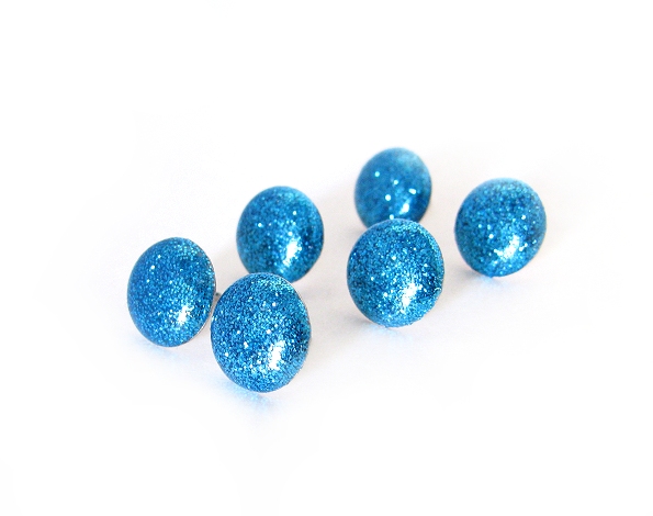
And of course, by Nirvana, I mean a white background in photos. Neither is easy, though I dare say getting a white background is easier than reaching Nirvana. Maybe, I can make the white background thing a little bit easier. That way we can all put our energy into finding Nirvana. LOL
So the first place you want to start is to mess around with settings on your camera. Fortunately, even among point-and-shoots like mine (Canon Power Shot SX110 IS), those settings are fairly standardized. Some cameras may not have some of these, if you're not sure about yours check out the manual. (or search for tutorials online for your specific camera and it's features, which will probably be clearer)
The setting I've used in the past was Indoor. I'd set it to macro, maybe bump up the light balance a bit and take dozens of pictures. Then, I'd go into my photo editing software to clean it up, and find that the backgrounds weren't quite so pretty and white as they looked on the camera screen. I've been doing this for years, and somehow I still forget on occasion that my camera screen is a little overly bright. Anyway, in using the software to edit, I would hit a point where I could either get a nice white background -or- I could have the colors actually look like the thing I had photographed. Not a fun choice!
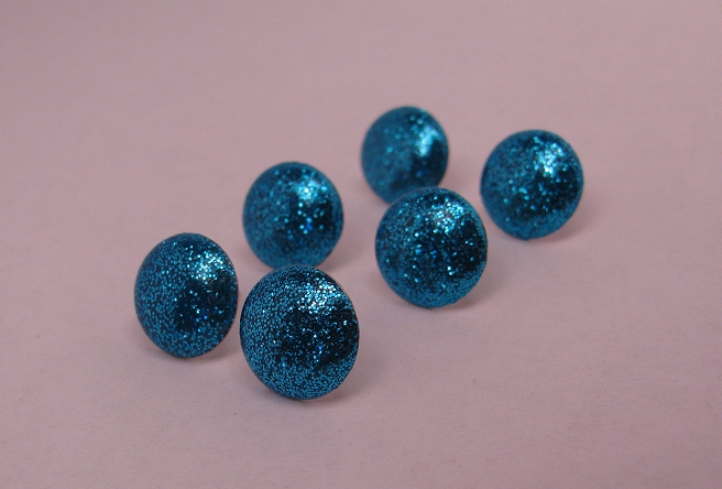
So, I decided to try the Program setting on my camera, and change the white balance setting to Tungsten. This is because I use regular non-fluorescent bulbs, which have a yellow/orange cast. Also known as warm white! Lovely in rooms, not so much in photos.

This setting produced an improved color temperature over the indoor setting, so I shut off the lights on my lightbox and was about to upload the pictures...
And then it occurred to me that perhaps I should try shooting without my lights on at all. It's pretty bright here in Phoenix, and the open side of my lightbox faces 1/2 a wall of glass, so it was worth a shot.

Bingo. The color temperature looked considerably more neutral on Indoor with the lights off than it did on program with the lights on. So, I cranked up my light balance (the +/- button) to +1.5 and...
Bam!

All I had to do at that point was up the contrast a bit to get that perfect white, and use a big white paintbrush to remove the darker areas around the edges of the picture, to arrive at the final image:

So there you have it... a brilliant white background and all I had to do was turn off the stinking lights. Who'da thunk it? Okay probably everyone else but every now and then I'm not as bright as I pretend to be ;)
So, here are all of the pics side by side so you can see the startling differences!

Hope this helps!!
Next installment will be about ... WHY IS THERE GLITTER IN MY ICED TEA? Oh, sorry. Noticed some glitter in mah tea. Risk of that craft that I do. Anyway,
We'll be talking about macros and cropping. Or, "How to make the focal point feel like it is at a natural place in the photo so the viewer's eyes don't go buggy" It matters more than it seems like it should!
<3
Amber
Friday, August 16, 2013
Photography Revisited pt 1

I turned my shop into an accidental guinea pig when I switched all of my photographs to a grey slate background from plain white. I had always liked the white, but I found it much easier to get natural looking colors by shooting on a grey background.
I had not realized the side effect that changing my pictures would have. When Etsy users are building treasuries, there are certain qualities the look for in photographs, one of the dominant traits being a white or very pale background. Treasuries like these are far more likely to make it to the homepage as well.
I have read many past forum threads where users complain about the overtly white backgrounder treasuries, with feelings that range from them being boring to being overtly exclusive and unfair. However, sites like Amazon require sellers to list the main photo with only the item for sale pictured, and it must be on a white background. I realize that Etsy did not start out as being remotely in the same realm as amazon, but as Etsy has grown they have needed to compete with such web giants, and let's face it, if they did not then there wouldn't be as many users browsing the site as there are today.
But, I digress. The important takeaway from my unintentional experiment is that the number of treasuries my items have been featured in has dropped like a stone. It started out somewhere around one or more per day to maybe two per week. Also, now when my items are in treasuries, it's usually in that last row - the one that isn't seen on the front page unless other items sell while it's up. In unison with the drop in treasuries, my sales dropped as well.
Knowledge gained: white backgrounds matter, as does the color balance of the overall photo. You don't need to give every photo on a listing the white background treatment, just the first photo. ( the one the thumbnail generates from)
Of course there are other factors, including depth of focus, sharpness, and positioning, but if all those elements are in place but the background isn't white, you could be missing out on treasury time!
As always, don't be afraid to experiment and find out what works for you- let the numbers be your guide as to whether your pictures are hurting or helping your product's visibility.
Next time we will start digging into how to get crisp white backgrounds.
Till then! <3
Amber
Saturday, October 22, 2011
Art / Craft Shows: Displays
In the world of craft shows, there are some big do's and dont's when it comes to displays for jewelry. I try to carefully consider every aspect of my displays when I'm working on putting them together, and my main points of concern are as follows:
-color palette
It is important that the display not overwhelm the jewelry itself, and I've had a few displays that got far more compliments than the jewelry on it. I've even had people ask to purchase my homemade displays, or ask me to make one for them. (which in and of itself wasn't a bad thing, it was a lot of fun designing one for someone else!) Nonetheless, the most important part of your display is that the jewelry looks stunning and the display itself is not attention getting.
-height
Laying jewelry (and many other products) flat on a table has to big negative effects - it makes it far to easy to walk right on past your table without noticing a thing, and it can give the appearance of a yard sale table. Neither of these are good, so using vertical displays and risers as well as taller tables can help push your display into eye contact range.
-weight
My back doesn't appreciate heavy displays, so I have to make sure that everything I use is as light as possible. Fortunately the jewelry I sell isn't heavy at all, but some of the ceramic trays I use are!
-uniqueness
When I'm at a craft show shopping, I am looking for quirky, unique, handmade things that each have their own special story and are hopefully one of a kind. When I see a display that utilizes jeweler's trays heavily or otherwise looks kind of like something you'd see in a mall, I almost invariably ignore that stand. It's not to be mean, it's because I know from experience booths like that rarely have anything I'd be interested in. In fact, I'm usually more interested in the table with a few things carefully laid out even if it breaks all the other rules. The idea is somewhere in the middle - a display that looks professional but doesn't look like it could have come from any store in your city.
-expense
We're all trying to earn money from shows rather than break the bank setting up for it. I usually have a pretty firm budget about what I'll pay for the items I need. I know that as I earn money I can buy an expensive piece here or there that will improve my display - and simple, inexpensive things can make gorgeous displays with a little effort and know how.
-durability
Once upon a time I thought it would be fun to use origami to display jewelry... it looked pretty cool when initially set up, but as people handled it, some pieces came unfolded and others weren't solid or heavy enough to continue standing up properly. I learned that displays need to be durable in the way that they will withstand people walking by and touching them without falling over, collapsing, or coming undone halfway through the day. This usually isn't a problem with purchased displays, more so with the ones I make. When I make them, the fewer moving parts there are, the better!
-how well it shows the jewelry off
Of course this is the most important part. Sure you can find a cheap piece of something to sit your earrings on but will it play them up to their best? Probably not. Some earrings look best on cards, others look best freely hanging. Bangles can look great in just about any setting, but chain bracelets can look limp and less inviting if not displayed right. It is important to have a variety of types of displays and I like to have more than I need. Since my jewelry is handmade and each piece is unique, the same setup won't work each time as my stock constantly changes.
With all of this in mind, here are some of my favorite ways to display jewelry.
- Most earrings go on cards and are then hung from some type of rack. Currently, I am using a metal grid display with Christmas ornament hooks to hang them and in the past I used converted lamps. The lamps were great, but I learned to keep them as plain as possible to keep the focus on the jewelry. The deconstructed lamp shades can also be sat on a lazy susan so that they can be turned. (I had the finial's on somewhat loosely so that the lampshades turned freely) Other earrings are laid down or hung without cards from bars or little wire displays
- The craft stores is a great place to get displays - check the unfinished wood items for a treasure trove of ideas. It is there that I got two different sizes of wooden trays intended to have mosaic added to them. They kind of look like mini serving trays, and I will be sanding and painting them, and adding a fixture to the back so that they can hold a necklace and stand up like easels. There are also items that can be painted and used as risers like trays and crates, and a multitude of other fun things. (I've decided to make using these options a post of their own... I could post several paragraphs just on painting!)
- I do use a few busts for necklaces, simply because there are necklaces I make that cannot have justice done to them by laying down or hanging flat. They have to be displayed on a neck in order to convey that they are indeed necklaces and not just sculptures. Most of my necklaces are on chains or cords, and can be hung in picture frames or on the aforementioned mini trays, or laid out flat.
- For the jewelry I'm laying out flat, I like to take some sort of dish and fill it with something that is visually attractive but also not too busy. I'd use sand, except that it would get all over my jewelry and be a mess to use. Sand just happens to be the ideal in non busy because the particles are so small. I know many people use beans or rice, but for me it's too "off" white and busy of a backdrop for my jewelry. I'm going to try out some little glass pebbles (about rice size) and see how that works. Other options are putting a piece of fabric in the bowl on top of a filler of your choice, not using any filler at all, or using dried moss as a filler. It retains its gorgeous green color and provides a lovely backdrop especially for metal or light colored jewelry.
- For rings and bracelets, I have yet to figure out what I prefer as a display. The bracelets will probably end up laid out flat in one of my trays or draped over something. Rings do seem to work best in trays or individual boxes, but I will have to come up with a solution for them as I have quite a few to display.
These are the fairly inexpensive displays I've come up with for my table, feel free to share in the comments any ideas you've had!!
-color palette
It is important that the display not overwhelm the jewelry itself, and I've had a few displays that got far more compliments than the jewelry on it. I've even had people ask to purchase my homemade displays, or ask me to make one for them. (which in and of itself wasn't a bad thing, it was a lot of fun designing one for someone else!) Nonetheless, the most important part of your display is that the jewelry looks stunning and the display itself is not attention getting.
-height
Laying jewelry (and many other products) flat on a table has to big negative effects - it makes it far to easy to walk right on past your table without noticing a thing, and it can give the appearance of a yard sale table. Neither of these are good, so using vertical displays and risers as well as taller tables can help push your display into eye contact range.
-weight
My back doesn't appreciate heavy displays, so I have to make sure that everything I use is as light as possible. Fortunately the jewelry I sell isn't heavy at all, but some of the ceramic trays I use are!
-uniqueness
When I'm at a craft show shopping, I am looking for quirky, unique, handmade things that each have their own special story and are hopefully one of a kind. When I see a display that utilizes jeweler's trays heavily or otherwise looks kind of like something you'd see in a mall, I almost invariably ignore that stand. It's not to be mean, it's because I know from experience booths like that rarely have anything I'd be interested in. In fact, I'm usually more interested in the table with a few things carefully laid out even if it breaks all the other rules. The idea is somewhere in the middle - a display that looks professional but doesn't look like it could have come from any store in your city.
-expense
We're all trying to earn money from shows rather than break the bank setting up for it. I usually have a pretty firm budget about what I'll pay for the items I need. I know that as I earn money I can buy an expensive piece here or there that will improve my display - and simple, inexpensive things can make gorgeous displays with a little effort and know how.
-durability
Once upon a time I thought it would be fun to use origami to display jewelry... it looked pretty cool when initially set up, but as people handled it, some pieces came unfolded and others weren't solid or heavy enough to continue standing up properly. I learned that displays need to be durable in the way that they will withstand people walking by and touching them without falling over, collapsing, or coming undone halfway through the day. This usually isn't a problem with purchased displays, more so with the ones I make. When I make them, the fewer moving parts there are, the better!
-how well it shows the jewelry off
Of course this is the most important part. Sure you can find a cheap piece of something to sit your earrings on but will it play them up to their best? Probably not. Some earrings look best on cards, others look best freely hanging. Bangles can look great in just about any setting, but chain bracelets can look limp and less inviting if not displayed right. It is important to have a variety of types of displays and I like to have more than I need. Since my jewelry is handmade and each piece is unique, the same setup won't work each time as my stock constantly changes.
With all of this in mind, here are some of my favorite ways to display jewelry.
- Most earrings go on cards and are then hung from some type of rack. Currently, I am using a metal grid display with Christmas ornament hooks to hang them and in the past I used converted lamps. The lamps were great, but I learned to keep them as plain as possible to keep the focus on the jewelry. The deconstructed lamp shades can also be sat on a lazy susan so that they can be turned. (I had the finial's on somewhat loosely so that the lampshades turned freely) Other earrings are laid down or hung without cards from bars or little wire displays
- The craft stores is a great place to get displays - check the unfinished wood items for a treasure trove of ideas. It is there that I got two different sizes of wooden trays intended to have mosaic added to them. They kind of look like mini serving trays, and I will be sanding and painting them, and adding a fixture to the back so that they can hold a necklace and stand up like easels. There are also items that can be painted and used as risers like trays and crates, and a multitude of other fun things. (I've decided to make using these options a post of their own... I could post several paragraphs just on painting!)
- I do use a few busts for necklaces, simply because there are necklaces I make that cannot have justice done to them by laying down or hanging flat. They have to be displayed on a neck in order to convey that they are indeed necklaces and not just sculptures. Most of my necklaces are on chains or cords, and can be hung in picture frames or on the aforementioned mini trays, or laid out flat.
- For the jewelry I'm laying out flat, I like to take some sort of dish and fill it with something that is visually attractive but also not too busy. I'd use sand, except that it would get all over my jewelry and be a mess to use. Sand just happens to be the ideal in non busy because the particles are so small. I know many people use beans or rice, but for me it's too "off" white and busy of a backdrop for my jewelry. I'm going to try out some little glass pebbles (about rice size) and see how that works. Other options are putting a piece of fabric in the bowl on top of a filler of your choice, not using any filler at all, or using dried moss as a filler. It retains its gorgeous green color and provides a lovely backdrop especially for metal or light colored jewelry.
- For rings and bracelets, I have yet to figure out what I prefer as a display. The bracelets will probably end up laid out flat in one of my trays or draped over something. Rings do seem to work best in trays or individual boxes, but I will have to come up with a solution for them as I have quite a few to display.
These are the fairly inexpensive displays I've come up with for my table, feel free to share in the comments any ideas you've had!!
Thursday, October 20, 2011
Art / Craft Show Setup: Lighting
As you know, I am a jewelry designer in addition to making JellyPins. I have decided to get back into the craft show circuit to further my goal of spending most of my time on my creative pursuits and leaving my full time job in export or possibly dropping to part time.
Planning for first few shows has me running into several walls, and I thought it may be helpful to you if I were to share my solutions here as I know these are common questions and problems that others run into.
The first, biggest bear for me to wrestle was lighting. I know it is extremely important in selling jewelry, and I have witnessed customers flock to booths that are well lit while bypassing those that have no lighting.
I have some very strict qualifications for my lighting, other people are probably able to be more flexible in this department.
Here are the rules that lighting needed to fit:
-Battery Powered
-Small / easy to transport
-Bright spotlight style lights
-Can sit on table or be clipped or hung somewhere
-Inexpensive: my goal was to spend $5 or less per small spotlight (including shipping)
-Silver or White in color to go with my display
-At least 4 available for purchase (ran into this on Ebay)
I think I may have found just the right lights, I'll know for sure when I get them and I'll post an update on how awesome they are (or aren't!) AND they qualify for free shipping on Amazon.
Rite Lite Battery Powered Spotlights
Feel free to share in the comments any lighting you've found that works well. It took me quite a lot of searching to find these, and I'm sure there are other people out there looking for help finding the right lights too!
Next post: Displays
Planning for first few shows has me running into several walls, and I thought it may be helpful to you if I were to share my solutions here as I know these are common questions and problems that others run into.
The first, biggest bear for me to wrestle was lighting. I know it is extremely important in selling jewelry, and I have witnessed customers flock to booths that are well lit while bypassing those that have no lighting.
I have some very strict qualifications for my lighting, other people are probably able to be more flexible in this department.
Here are the rules that lighting needed to fit:
-Battery Powered
-Small / easy to transport
-Bright spotlight style lights
-Can sit on table or be clipped or hung somewhere
-Inexpensive: my goal was to spend $5 or less per small spotlight (including shipping)
-Silver or White in color to go with my display
-At least 4 available for purchase (ran into this on Ebay)
I think I may have found just the right lights, I'll know for sure when I get them and I'll post an update on how awesome they are (or aren't!) AND they qualify for free shipping on Amazon.
Rite Lite Battery Powered Spotlights
Feel free to share in the comments any lighting you've found that works well. It took me quite a lot of searching to find these, and I'm sure there are other people out there looking for help finding the right lights too!
Next post: Displays
Subscribe to:
Posts (Atom)