Showing posts with label pic. Show all posts

Saturday, September 7, 2013

Photography - Finding the Sweet Spot (of focus)

I'm going to use a photograph that is a much larger scale than product photography typically is, in order to better illustrate where the focal point falls in an image.


In the first photo, the majority of the picture is out of focus, but near the middle there is a crisp area of pavement that catches the eye. The second photo has been cropped so that the focused area is closer to the bottom of the frame, which feels more natural to the eye than having out of focus area at the bottom.

This is because our eyes find it natural that the closest part of the picture is in focus, but when the bottom of the frame is out of focus, our eyes attempt to bring that area into focus when we look at it. It can actually cause physical discomfort.

When you are taking photos of small items using a macro setting on your camera, you want the leading edge of the object to be in that crisply focused area. Here is an example:


Here is the photo before cropping, with a line indicating where the focus zone falls:


When cropping your photos of small objects, it is best to have that focus zone on the bottom 1/3 line. This is a concept of photography, where the visual frame is divided in thirds horizontally and in thirds vertically. In framing a photo, the guideline is to have the primary subject on one of the lines delineating the thirds of the photo. Here is the image again, with an overlay grid showing the horizontal and vertical thirds:


Notice that the focal line which was marked earlier is now lined up with the bottom 1/3 line, and the left most area of the product is approximately over the left 1/3 line. When cropping, the crop would follow the outer edges of the grid, so that the thirds remain lined up as they are.


That leaves you with a photo cropped so that the focal line is in a very comfortable and natural spot, which draws the eye (and the viewer) in!

Thursday, August 29, 2013

The Weekly Ten - Fab Craft Show Booths

For this week's post of ten things I adore, I want to share with you some lovely craft show displays found on Pinterest and Flickr. Thanks to the people who shared these to inspire us all!


Such a great group of displays, I for one can learn a thing or two from each of them!

You can find more of the same on the JellyPins Pinterest board! Till next time~
Amber

Monday, August 19, 2013

Photography - Reaching Nirvana


And of course, by Nirvana, I mean a white background in photos.  Neither is easy, though I dare say getting a white background is easier than reaching Nirvana.   Maybe, I can make the white background thing a little bit easier.  That way we can all put our energy into finding Nirvana. LOL

So the first place you want to start is to mess around with settings on your camera.  Fortunately, even among point-and-shoots like mine (Canon Power Shot SX110 IS), those settings are fairly standardized.  Some cameras may not have some of these, if you're not sure about yours check out the manual.  (or search for tutorials online for your specific camera and it's features, which will probably be clearer)

The setting I've used in the past was Indoor.  I'd set it to macro, maybe bump up the light balance a bit and take dozens of pictures.  Then, I'd go into my photo editing software to clean it up, and find that the backgrounds weren't quite so pretty and white as they looked on the camera screen.  I've been doing this for years, and somehow I still forget on occasion that my camera screen is a little overly bright.  Anyway, in using the software to edit, I would hit a point where I could either get a nice white background -or- I could have the colors actually look like the thing I had photographed.  Not a fun choice!

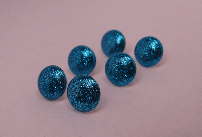
                                          Way too much magenta!  Ewww.

So, I decided to try the Program setting on my camera, and change the white balance setting to Tungsten.  This is because I use regular non-fluorescent bulbs, which have a yellow/orange cast.  Also known as warm white!  Lovely in rooms, not so much in photos.

                                          Too much blue, not enough green.

This setting produced an improved color temperature over the indoor setting, so I shut off the lights on my lightbox and was about to upload the pictures...

And then it occurred to me that perhaps I should try shooting without my lights on at all.  It's pretty bright here in Phoenix, and the open side of my lightbox faces 1/2 a wall of glass, so it was worth a shot.

                                          Pretty close to aaahhh-mazing!


Bingo.  The color temperature looked considerably more neutral on Indoor with the lights off than it did on program with the lights on.  So, I cranked up my light balance (the +/- button) to +1.5 and...


Bam!

                                         There it is!

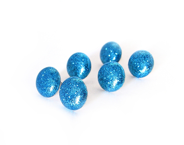
All I had to do at that point was up the contrast a bit to get that perfect white, and use a big white paintbrush to remove the darker areas around the edges of the picture, to arrive at the final image:

                                                      I dream about pictures like this.

So there you have it... a brilliant white background and all I had to do was turn off the stinking lights.  Who'da thunk it?  Okay probably everyone else but every now and then I'm not as bright as I pretend to be ;)

So, here are all of the pics side by side so you can see the startling differences!


Hope this helps!!


Next installment will be about ... WHY IS THERE GLITTER IN MY ICED TEA?  Oh, sorry.  Noticed some glitter in mah tea.  Risk of that craft that I do.  Anyway,

We'll be talking about macros and cropping.  Or, "How to make the focal point feel like it is at a natural place in the photo so the viewer's eyes don't go buggy"  It matters more than it seems like it should!

<3
Amber

Friday, August 16, 2013

Photography Revisited pt 1

In the time that has passed since I last wrote about product photography for online shops, I've learned something interesting.

I turned my shop into an accidental guinea pig when I switched all of my photographs to a grey slate background from plain white.  I had always liked the white, but I found it much easier to get natural looking colors by shooting on a grey background.

I had not realized the side effect that changing my pictures would have.  When Etsy users are building treasuries, there are certain qualities the look for in photographs, one of the dominant traits being a white or very pale background.  Treasuries like these are far more likely to make it to the homepage as well.

I have read many past forum threads where users complain about the overtly white backgrounder treasuries, with feelings that range from them being boring to being overtly exclusive and unfair.  However, sites like Amazon require sellers to list the main photo with only the item for sale pictured, and it must be on a white background.  I realize that Etsy did not start out as being remotely in the same realm as amazon, but as Etsy has grown they have needed to compete with such web giants, and let's face it, if they did not then there wouldn't be as many users browsing the site as there are today.

But, I digress.  The important takeaway from my unintentional experiment is that the number of treasuries my items have been featured in has dropped like a stone.  It started out somewhere around one or more per day to maybe two per week.  Also, now when my items are in treasuries, it's usually in that last row - the one that isn't seen on the front page unless other items sell while it's up.  In unison with the drop in treasuries, my sales dropped as well.

Knowledge gained: white backgrounds matter, as does the color balance of the overall photo.  You don't need to give every photo on a listing the white background treatment, just the first photo.  ( the one the thumbnail generates from)

Of course there are other factors, including depth of focus, sharpness, and positioning, but if all those elements are in place but the background isn't white, you could be missing out on treasury time!

As always, don't be afraid to experiment and find out what works for you- let the numbers be your guide as to whether your pictures are hurting or helping your product's visibility.

Next time we will start digging into how to get crisp white backgrounds.

Till then! <3

Amber